Sushima
How we enhanced Sushima's user experience and created an online ordering feature
Product Photography
is from Mudrá
TIMELINE
DELIVERABLES
4 weeks
UX Research - High Fidelity Prototype
We gave the restaurant's website a makeover and added an online ordering system. Ordering sushi has never been easier!
OVERVIEW
Vicente Malonda - Ana Calvo - Ricardo Baquero
TEAM
Sushima, a Japanese restaurant in Xativa, Valencia, is known for its high-quality sushi. Despite minimal competition within 20km, their outdated website and lack of online ordering limited customer engagement.
PROBLEM STATEMENT
What can be improved?
To help Sushima thrive, we spoke with stakeholders, customers, and food delivery app users. We learned the following:
Once we gathered all those insights, we created a User Persona: a fictional client, an archetype that represents all the needs of Sushima’s users. Meet Neus López!
Neus López, a dentist in Xativa, loves food, travel, and new experiences but craves more convenience in her routine. She’s frustrated by the lack of local sushi delivery, Sushima’s website with no delivery option or enticing visuals, and orders blocked at busy times.
So if we want to align business' and users' needs, we ask ourselves the following question:
How can we create a seamless ordering experience for users like Neus while optimizing Sushima's small kitchen capacity during peak hours?
DESIGNING THE SOLUTION
Let’s build the prototype!
To address Sushima’s challenges, we started with a Minimum Viable Product (MVP), focusing on 3 essential features:
Time slot selection for efficient kitchen management.
Product photos and descriptions, with allergen and vegetarian info.
Order-tracking feature to improve transparency.
What do users have to say?
After building a Low and Mid-Fi prototype that mapped a user’s journey (from browsing the menu to order confirmation), we conducted usability tests to identify improvements:
Added a dedicated vegetarian section.
Adjusted alert messages to sound more friendly.
Simplified cart buttons for clarity.
Made the order-tracking process more intuitive.
To guide the new design, we defined Sushima’s vibe as young, experimental, open-minded, and trendy, with some mood board help. We chose a salmon, cream, and dark brown palette with blue and yellow accents for clarity, paired with modern, readable typography: Helvetica Lt Std for headlines and Avenir Bold for text.
Defining
the visuals
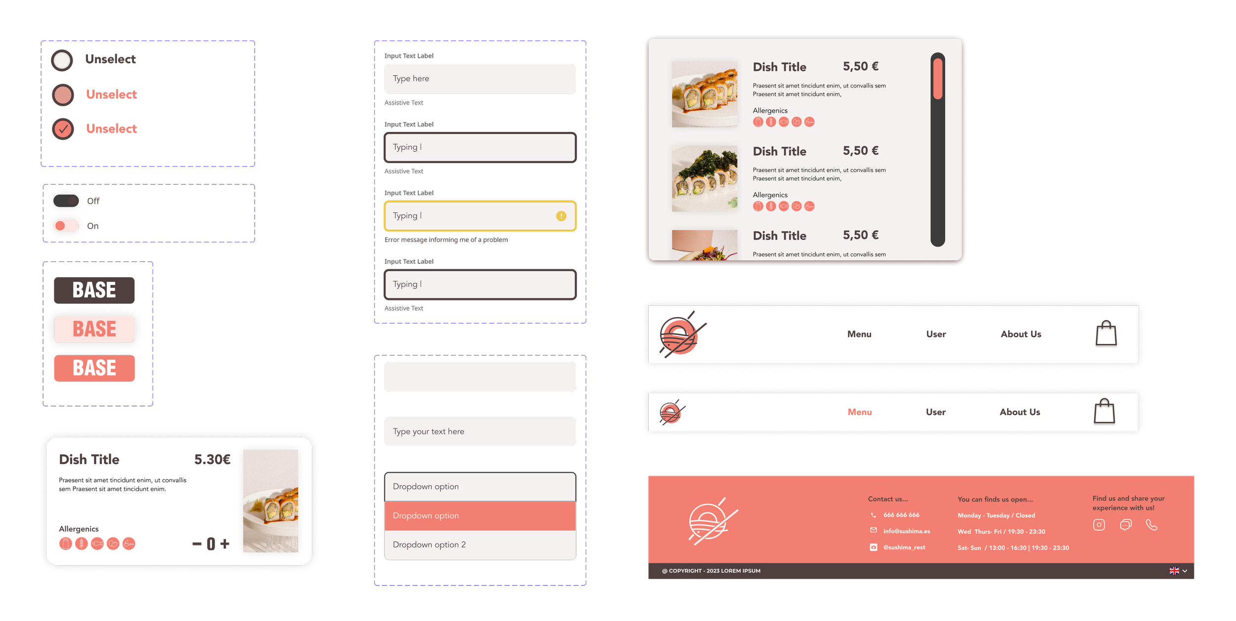
WEBSITE ELEMENTS
With the new style defined, next step was creating website components, ensuring that all design elements were cohesive and aligned with Sushima's brand attributes.
Components and more components
Meet Sushima’s improved website!
In the menu page, we located a top banner to reduce user effort, highlighting combos and popular products for quick selection. Product cards were designed to display key information users value: Price for informed decisions, Description for clarity, Allergen Info for inclusivity and Dish Images for visual appeal.
In the checkout page, we introduced a time slot selection feature, allowing users to choose their preferred delivery time. This improved the experience by reducing uncertainty and ensuring timely deliveries.
Business impact of the solution.
HIGHER REVENUE.
Combos and visuals drive
conversions and boost order value.
EFFICIENT OPERATIONS.
Time slot selection
optimizes kitchen workflow.
INCREASED LOYALTY.
A seamless experience
encourages users to repeat orders.


