Shazam
Shazam’s UI redesign: enhancing user experience and engagment
Shazam’s interface and user experience have remained largely unchanged. I redesigned it for Android, focusing on improving its user experience and visual appeal
OVERVIEW
High Fidelity Prototype
TIMELINE
DELIVERABLES
2 weeks
The scope of the project encompasses a happy path where users enter the app to shazam a song and then navigate through other screens in order to discover more functionalities Shazam offers.
Therefore, I selected 5 main screens to redesign: from the smallest atoms to the whole wireframes. I recreated them in our loved Figma.
First step, cloning in Figma.
ATOMIC DESIGN
Wait… so what am I going to redesign
Yes, the project is about redesigning Shazam’s app. But… what should I redesign? How should I do it? Why should i do it?
I decided to first evaluate the app’s design according to some design principles (Heuristics analysis), which let me identify its strengths and weaknesses in terms of concept, usability and aesthetics.
Some of the things I recognize could be improved were:
Playing a song is not noticeable and there are no progress bars displayed.
Clickable song sections aren’t very intuitive.
It’s hard to notice the horizontal scrolling for changing screens.
When you delete a song from your shazammed songs list, there is no undo option.
There’s not much uniformity when it comes to style and colors. Some screens look very different.
DEEPER INTO UI
Visual competitive analysis.
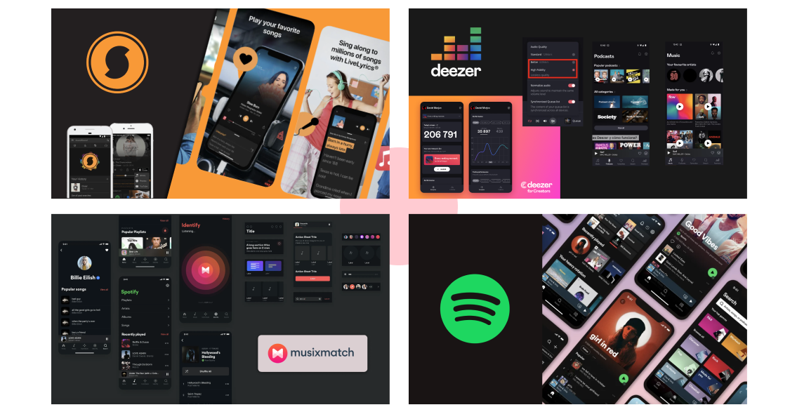
To take care of the look and feel, I first conducted a visual competitive analysis in order to see market patterns and similar visual features amongst other music recognition and streaming apps. Some of these apps were Soundhound, Musixmatch, Deezer and Spotify.
Therefore, what went through my mind was: “These market patterns are there for a reason. They have a thought behind them. So, do I want to follow them or aim for a change?”
For one part, I thought it would be nice to differ from the saturated and energetic colors. But when it came to the dark interfaces, I found this quote from Michelle Kadir, Director of Product development on Spotify, and took it as an opportunity:
“When the lights dim, the movie, not the theater, becomes the experience. Spotify believes listeners should feel like that when they listen to the service’s music. A darker color scheme accentuates the cover art, photographs of artists, and the most important navigation buttons, like play.”
Brand attributes and moodboard.
I decided the transition to the new Shazam had to be defined by 4 main attributes:
Artistic, creative, playful and young.
I felt the old app didn’t evoke any emotions on the user, the interface is plain and colors don’t offer any difference on the experience. And so I built a moodboard with these new attributes i created.
Colors and typography.
Going onward, for deciding the colors I would use in the app I first extracted 4 main colors from the moodboard: green, red, cream and black.
However, they didn’t evoke “playful” to me, so I decided to change the red for a jolly pink.
For the typography, I chose a sans serif font like Poppins Black for the headings, and our old friend Roboto for the body, which is the standard Android font.
STYLE TILE AND COMPONENTS
Let’s make these ideas pretty!
Up to this point, this looks very nice… but how is this new app REALLY going to look?
I created all the UI elements and gathered them in a style tile, along with some of the fonts and colors in order to invision the final product.
the new Shazam.
Introducing
Join me on this journey and meet a more engaging app where interaction is effortless.
Want to test the prototype? Do it here!
3 dots to indicate user about the horizontal scrolling
Song cards are visible and user can perceive they are clickable easily.
Message displayed so the user can undo the action after deleting a song.
Designed according to Android design guidelines, so users feel the app more familiar.
Video carrousel for all top songs
Whole screen for song options in a more minimalist design. Close tab button on top right of the screen.
In tune with the rest of the app, to break with the design inconsistency of the current Shazam app.
Informational message displayed for users when they log in the app for the first time:
“Scroll to slide and discover other screens!”.
This makes the UX easier and more accessible.
Final thoughts?
In conclusion, Shazam’s redesign aimed to enhance the user experience by simplifying the interface, unifying the style and incorporating pastel colors and more modern and youthful vibe.
I believe these changes create a more intuitive and enjoyable experience for users and make the app more visually appealing and engaging.
Thanks for stopping by!


