Blog page Redesign
Streamlining blog navigation for better content discovery.
OVERVIEW
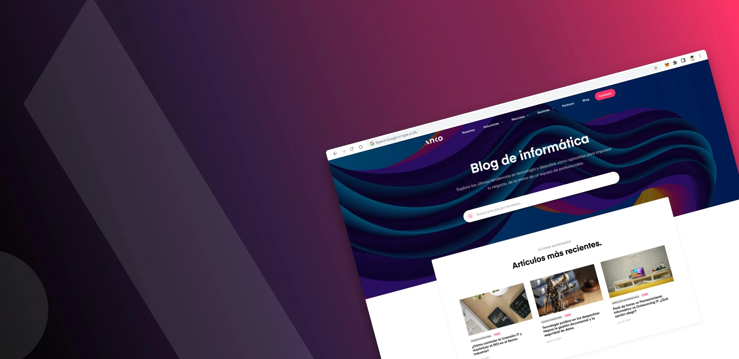
Redesigning the blog landing page of an IT consultancy to simplify and optimize navigation.
METHODOLOGY
Lean UX approach
The original blog landing page struggled to connect with users and felt like a treasure hunt: Navigation features tucked away and visitors were left to scroll aimlessly, missing out on valuable content.
So the challenge was clear: make the blog landing page a breeze to navigate, spotlight new content, and ensure users can find exactly what they’re looking for.
The challenge.
USER EXPERIENCE
Research and insights.
User pain points.
Analyzing user experience and journey patterns showed that accessibility and clarity were the top priorities. Users needed an intuitive, accessible search, clearly visible categories, and easy-to-navigate, fresh content. These insights guided our redesign priorities.
Competitive analysis.
Reviewing design standards from leading industry blogs confirmed that strategic elements—like a central search, visible categories, and highlighted recent content—are essential for reader engagement. These best practices informed our approach and supported our vision for the new design.
Redesigning the solution.
FIRST… A SEARCH BAR
In order to help users find their content more easily, I relocated the search bar to a prominent position at the top of the page, making it easily accessible and reducing frustration.
RECENT ARTICLES SECTION
A dedicated 'recent articles' section was added to the landing page, to highlight fresh content, encouraging users to explore new insights without having to search actively, thereby increasing engagement.
CATEGORY VISIBILITY
Categories were also redesigned to be clear and strategically placed for better visibility.
This empowers users to discover content that truly resonates with them, creating a more personalized browsing experience.
RESPONSIVE DESIGN
Designing for different screens and devices.
To create an optimized experience on all screens, I structured the layout around the our key breakpoints:
Desktop (1920x1080px)
Laptop (1024x768px)
Mobile (360x800px)
Impact of the project.
Increased user engagement. The redesigned layout, featuring a prominent search bar, clear categories, and a recent articles section, encourages users to explore content more deeply and stay on the site longer.
Improved content discoverability. Enhanced navigation options and filtering tools help users find relevant information faster, making the blog more valuable and accessible to diverse audiences.
Modernized brand presence: The fresh, user-focused design elevates the consultancy's online presence, fostering a modern, credible brand image.


