How I created a responsive Design System for an IT consultancy.
View the whole Design System file here.
Design System
This project was for an IT consultancy based in Barcelona that offers a wide range of B2B solutions. As the business grows and expands, I created a responsive Design System to ensure consistency across the different pages and enhance user experience.
OVERVIEW
UX / UI Lead designer
ROLE
Responsive Design System in Figma
DELIVERABLES
The challenge.
Joining a growing design department, I encountered a challenge with our design tools and methods in their early stages. Our approach primarily relied on Canva and informal "design by eye" techniques.
For each new project, we found ourselves recreating components from scratch, leading to inefficiencies in our workflow.
Additionally, the website was optimized only for desktop screens at 1920 x 1080 px, with limited adaptation for other breakpoints. This resulted in suboptimal user experiences on mobile devices and potential loss of leads.
There was an inconsistency across the different landing pages, design was not responsive, design processes were long and communication with developers was uneffective.
Impact of implementing the Design System.
Brand consistency. Now all design elements maintain a consistent look and feel, aligning with the brand’s identity.
Efficiency and cost saving. With a component library, design processes are faster and there’s less need for design revisions and corrections, ultimately saving the company money and resources.
Improved cross-functional communication. The design system provides an explained reference point for the development team. They can inspect files and handoff becomes easier.
Scalability. As the company is growing, this design system ensures that design scales with it.
User-centered design. This design system leads to products that are more user-friendly and appealing, since it focuses on user experience (UX) and User Interface (UI) best practices.
GETTING STARTED
Website audit and building components in Figma.
Since I had to build this Design System from the ground up, I started by performing a website audit. I recreated all the elements and components I gathered in Figma, from simple to more complex structures.
In order to better organize the following work, I structured the design file in 3 parts:
Introduction. Context about the design system and its structure.
Fundamentals. The basics: Color, typography, layout and grids…
Components. The reusable and consistent design elements with its specs and docummentation.
An inside look on the basics.
Come on, you can scroll a bit more!
Typography.
In this section I created a whole typescale with weights, sizes and a description for the usage.
Elevation.
To enrich the website visuals I defined different elevation states and created a shadow library for the different elements.
Grids & Layout.
By analyzing our website metrics in Google Analytics (‘Users by screen resolution’ table) I saw that these were the 3 most used by our users:
Desktop (1920 x 1080 px)
Laptop (1024 x 768 px)
Mobile (360 x 800 px)
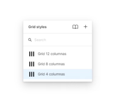
So I established 3 different grids for the 3 different breakpoints or screens.
Spacing.
At the time I started building the Design System, website design wasn’t consistent on spacing.
I am currently working on this, establishing base units and ratios so the business can guarantee a harmonious experience for the end user.
Component properties.
This may be one of the reasons why Figma is the greatest tool to build Design Systems: Components and their properties.
Take this card, for example. You can modify its properties (change the title and description and hide or show the button) as fast as a click.
We can also make a component change in different screen sizes or resolutions and dark or light mode in a matter of seconds.
A ‘developer-friendly’ Design System.
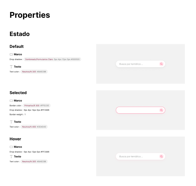
To bridge the gap between design and development, I decided to add some ‘specs’ (specifications) in each of the sections.
This helps developers understand better the anatomy and properties of each of the components, reducing non-essential communication and improving productivity.


